Where warmth starts before you arrive
Oreos Café is a neighbourhood favourite that needed a digital home to match its heart — welcoming, current, and effortlessly usable from the moment you land.
Brief
Familiar but fresh
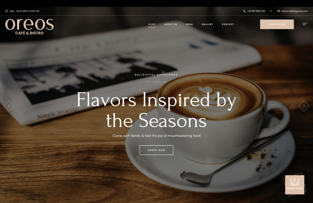
Oreos Café had loyal regulars but no digital presence to speak of. The brief was deceptively simple: build something that feels like the café itself — warm, honest, and easy to use. No unnecessary complexity.
We designed a menu-forward web experience grounded in warmth. The brand identity draws on natural tones — warm creams, soft blacks — paired with a typeface that feels handpicked, not generic.
Menu UI
The menu is the product
For a café, the menu is everything. We designed a menu interface that makes browsing genuinely pleasant — categories scroll horizontally, items display with photography and clean typographic hierarchy, and filtering is instant.
The system is fully CMS-driven. The team updates items, prices, and specials in minutes. Seasonal menus are a toggle, not a redesign.
Menu Interface — Category Browse & Item Detail
Branding
The visual identity extends to packaging, in-store signage, and social media templates — all delivered as a ready-to-use design system. The café now has a consistent look that scales as the brand grows.